The Stock Market Just Repeated a Once-in-a-Century Pattern – Here’s What Comes Next

Markets are flashing a signal so rare, it’s only happened once before. Buckle up.
### The Ghost of 1929 (or 1987?) Rises Again
When the charts whisper a century-old secret, traders listen. This setup last appeared before the Great Depression – and the aftermath wasn’t pretty.
### The Algorithmic Doom Loop
Modern markets don’t crash like they used to. Now they algorithmic their way into oblivion at light speed. Thanks, quant funds!
### Silver Linings for Degens
History says pain’s coming. But crypto’s 24/7 casino never closes – and blood in the streets means generational buying ops. Just ask the ‘87 survivors who bought Apple at $0.35 (split-adjusted).
### The Cynic’s Take
Wall Street’s ‘rare pattern’ is just their way of saying ‘we have no damn clue.’ But hey – at least the commission fees will keep flowing.

Image source: Getty Images.
The stock market looks historically expensive
The sticker price of a stock doesn't tell you very much about whether or not it's a good value. In order to judge whether a stock is expensive, most investors will look at its price-to-earnings (P/E) ratio. The P/E takes the share price and divides it by the earnings per share for the company. All things being equal, investors prefer to buy stocks when their P/E ratios are low.
But earnings for companies generally don't grow in a straight line. Recessions, inflation, and all sorts of other economic pressures can impact earnings per share. And usually they affect the entire stock market, not just individual companies. That's why economist Robert Shiller developed the cyclically adjusted price-to-earnings (CAPE) ratio.
The CAPE ratio takes into account the last ten years of earnings and adjusts each year for inflation. The standard P/E ratio only looks at one year of earnings. Looking at a much longer period evens out the impact of economic shocks like recessions.
As of this writing, the S&P 500's CAPE ratio has climbed to 38.8. That's above the month-end peak from 2001, and the highest level we've ever seen outside of the dot-com bubble, when the ratio climbed above 40.
To give that valuation some more context, the S&P 500 (along with its earlier equivalents) has traded at an average CAPE ratio of 17.6 based on data going back to 1871. That multiple has climbed considerably in the modern era, though. Still, the average CAPE ratio for the index since the start of the century (which includes the peak of the dot-com bubble) is 27.6. The current valuation is 40% higher than that.
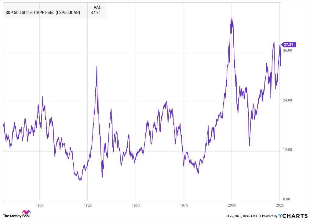
S&P 500 Shiller CAPE Ratio data by YCharts. Month-end numbers. Current CAPE Ratio is 38.8 as of market close on July 24, 2025.
Here's what's happened every time stocks have been this expensive
There have only been a handful of times when the S&P 500 traded at a CAPE ratio above 30. Two of the most notable instances were in 1929, just ahead of the Great Depression, and between 1997 and 2001, the height of the dot-com bubble.
Note that the CAPE ratio only exceeded 30 for a couple of months in 1929 before the stock market crashed, kicking off the Great Depression. By comparison, the S&P 500 continued to climb higher for years after breaching the threshold in June of 1997. Eventually, however, there was a massive decline in stock values, with the Nasdaq Composite falling 77% from its peak.
In the three other recent periods when the S&P 500 CAPE ratio exceeded 30, the index went on to drop 20% or more each time: in 2018, 2020, and 2022. With the CAPE ratio pushing toward record territory, it looks like another 20% decline may be on its way.
Are stocks truly expensive right now, or is it different this time?
It's worth noting that higher valuations have become the norm. And there's a key factor to consider when determining whether the S&P 500 has become overpriced: interest rates.
Warren Buffett once wrote: "In economics, interest rates act as gravity behaves in the physical world. At all times, in all markets, in all parts of the world, the tiniest change in rates changes the value of every financial asset."
One handy metric for comparing expected returns for stocks to fixed-income vehicles like bonds is the earnings yield. That's simply the inverse of the P/E ratio. Investors can compare the earnings yield to the yield on debt instruments like government bonds to see if they're getting good value.
Researchers Victor Haghani and James WHITE prefer to compare the earnings yield to the yield on inflation-protected government bonds (also known as TIPS) as the best way to determine how much extra return someone can expect for taking on the risk of investing in equities.
They point out that the last time we saw the CAPE ratio climb nearly this high in 2021, TIPS yielded negative 0.7%. As a result, stocks still offered considerable excess expected returns. That didn't stop the index from falling more than 20% in 2022, though, as interest rates climbed. When valuations ROSE during the dot-com bubble in 2000, TIPS actually offered a higher yield than the earnings yield on stocks. And sure enough, the S&P 500 produced negative real returns over the next decade.
Today, the earnings yield for the S&P 500 with a CAPE ratio of 38.8 is around 2.6%. Investors can get about 2% from 10-year TIPS right now. That puts the excess return for stocks at about 0.6%, which is relatively low.
So stocks do indeed look extremely expensive right now. Investors aren't getting much excess return for the risk they're taking on with equities, compared to "risk-free" government bonds that automatically factor in inflation.
That doesn't mean investors should sell their stocks entirely and put all their money into bonds. A shift in asset allocation may be warranted, especially for those focused more on capital preservation. But most investors may simply want to focus on finding good values in the stock market. Despite the historically high CAPE ratio, there still remain plenty of great values in the universe of investable stocks.
