Bitcoin’s Rainbow Chart Flashes Buy Signal—But Are Weak Hands Dragging the Market Down?

Bitcoin's so-called 'Rainbow Chart' is screaming buy—just as institutional interest hits a suspicious lull. The crypto's price action now sits squarely in the 'discount' zone historically followed by massive rallies. But here's the rub: trading volumes resemble a ghost town.
The Contradiction Nobody's Talking About
While technicals suggest fire-sale prices, spot ETF inflows have slowed to a trickle. Even retail traders—normally quick to FOMO—are sitting this one out. Either we're witnessing the steal of the decade, or the 'smart money' knows something chart patterns don't.
Wall Street's Selective Crypto Amnesia
Funny how traditional investors suddenly develop risk aversion when Bitcoin dips below their preferred entry points. Meanwhile, the same firms pushing 'diversification' are quietly accumulating at these levels—classic buy-the-rumor, sell-the-news behavior.
The chart says buy. The market says wait. And as always in crypto, the only certainty is that someone's getting rich while you're reading this.
Bitcoin Rainbow Chart Flashes Buy Signal
After hitting a new all-time high (ATH) on May 22, BTC has spent nearly a month consolidating between the $100,000 and $110,000 range, without showing a clear directional bias. Now, one of the most well-known indicators – the Bitcoin Rainbow Chart – is pointing toward potential upside for the top digital asset.
Crypto Rover shared the following chart, showing BTC currently trading in the light green, or “buy”, zone of the Rainbow pattern. Historically, bitcoin has often entered this zone shortly after each four-year halving, signalling potential growth ahead.
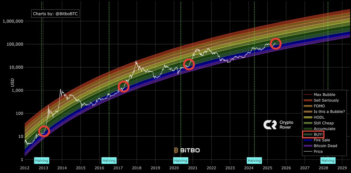
For the uninitiated, the Bitcoin Rainbow Chart is a long-term valuation tool that uses a logarithmic growth curve with color bands to show where Bitcoin’s price stands relative to historical trends. Each color band suggests a different market sentiment, helping investors identify potential overvaluation or undervaluation zones.
While the Rainbow Chart’s buy signal is promising, the broader demand for BTC appears lackluster. In a recent CryptoQuant Quicktake post, contributor Darkfost pointed out that sluggish demand is limiting Bitcoin’s ability to break out.
Darkfost shared the following chart, which compares new BTC supply to coins held inactive for over a year – used to gauge apparent demand. When the ratio moves above zero, it typically indicates strong market demand.
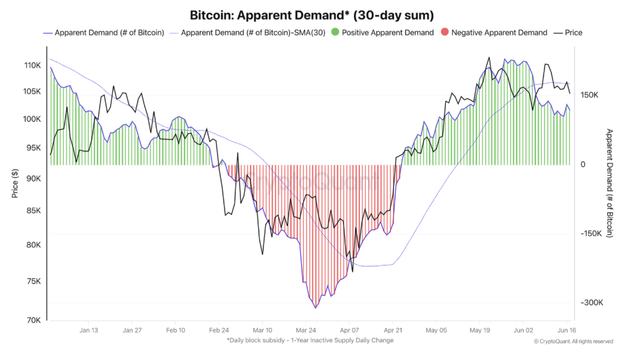
Since the last local top in May, this apparent demand metric has been gradually declining, though it remains sufficient to absorb current selling pressure. In essence, while BTC is managing to stay above the $100,000 level, demand is fading – a potential headwind.
However, some encouraging signs remain. In a separate X post, crypto trader Merlijn The Trader noted that the buy/sell pressure delta is showing an oversold signal, implying that short-term sellers could be nearing exhaustion.

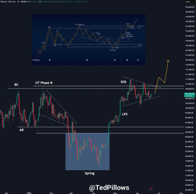
BTC Wyckoff Accumulation Nearing End?
Crypto market commentator Ted Pillows added that BTC may be in the final stage of the Wyckoff Accumulation pattern. According to Ted, a decisive breakout above $110,000 could send Bitcoin surging to $130,000 “in no time.”
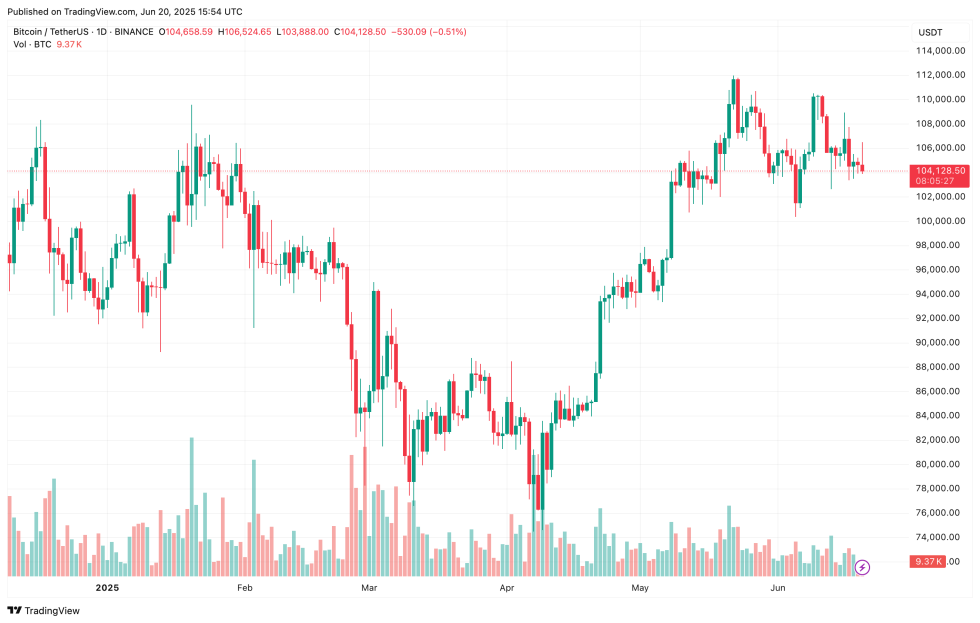
Overall, Bitcoin continues to demonstrate a healthy technical structure, maintaining support at the $104,000 level. The market also saw notable deleveraging following yesterday’s US Federal Reserve meeting.
That said, bitcoin exchange activity is starting to show signs of fatigue, while retail investors continue to stay on the sidelines. At press time, BTC trades at $104,128, up 0.2% in the past 24 hours.